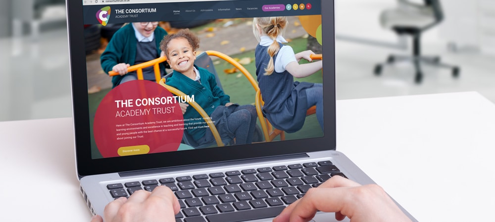
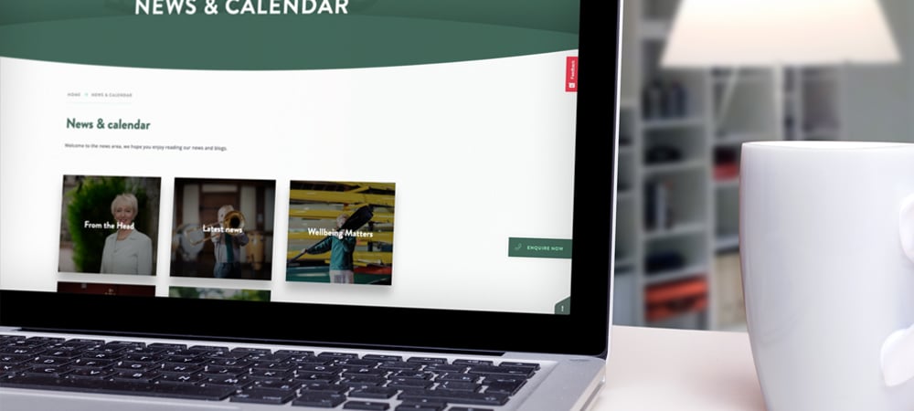
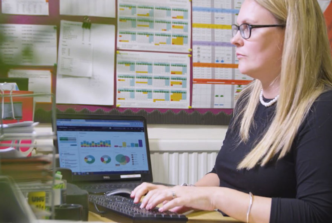
This is a question we are asked a lot by the schools we work with and something we continually ask ourselves as we strive to deliver the best experience possible for our clients. Ultimately, many elements go into producing a good school website, but here are six key things to get right.

What should a good website have?
- An SSL certificate.
- Clear representation of your school’s values and principles.
- Simple and intuitive navigation.
- Engaging and useful content.
- Up to date photography and information.
- A straightforward CMS.
Let’s take a look at each of these in a little more detail.
SSL Certificate
What is an SSL certificate, and how does it work?
SSL stands for Secure Sockets Layer: a system that lets computers communicate with each other. The term has since been updated to Transport Layer Security (TLS), but the name ‘SSL certificate’ still refers to the public key certificate belonging to it.
The certificate is a digital file that is associated with your school website. It proves that your website is legitimate, not run by an imposter, and it also encrypts the information that users put into it. This kind of encryption keeps data safe from anyone who could intercept the information and is particularly important when private information is being shared through the site.
What are the benefits of an SSL certificate?
In addition to the advantages mentioned above, there are other reasons why a school website needs to have an SSL certificate in place. Firstly, the browser could flag your site as unsafe without it, which could alarm or deter visitors from using it. A ‘danger signal’ is something you certainly don’t want to be associated with your school’s website.
Additionally, websites with SSL certifications tend to get higher rankings on search engines like Google. So, having an SSL certificate on your site will make it more visible to people surfing the internet and parents and students looking for helpful information.
Finally, an SSL certification shows your students and their parents that you are considerate of their safety. It also encourages safe internet usage and highlights that your staff have expertise in this area.
If your school website is not currently SSL certified, please get in touch with our educational communication experts, who can help.
Clear representation of your school’s values and principles
Websites have become one of the most important destinations for prospective parents thinking of sending their child to a school. It’s a great resource for information and may even provide someone with their first impressions of what your school is like.
As a result, it is crucial to reflect the correct values and principles in the website’s design and content. Doing this gives the school a chance to show what makes them unique and allows them to stand out from others in the local area.
Even if increasing pupil numbers is not a target, it is still essential for a good website to reflect its values and principles. In an ideal world, existing parents will regularly visit a school’s website, allowing the sharing of news and updates quickly.
As a direct benefit, when parents are actively engaged with your school’s website, you don’t have to rely so much on costly communications like text messaging or email. Achieving a situation where this is possible is much more likely if a school has a website that parents enjoy using and feel represents the school well.
It’s important to remember that not every school has the same objectives and, therefore, not every school website will be trying to achieve the same thing. There is a range of outcomes one may be hoping to gain from investing time and resources into a good website. Examples of this could include:
- Increasing pupil numbers.
- Achieving a greater level of parental engagement.
- Improving local reputation.
These objectives require a slightly different focus regarding design, messaging and overall experience. For example, achieving better engagement with existing parents means putting important news and updates front and centre, while increasing pupil numbers requires a greater focus on showing the schools facilities, values and achievements.
For an effective school website, both existing and prospective parents should be accommodated, but there should still be one clear priority that the site is built around.
Trying to achieve too much can lead to a confusing and disjointed experience that achieves very little.

Simple and intuitive navigation
What is a website navigation menu?
A website navigation menu refers to a list of internal links to other pages sitting on the site. These are usually positioned at the top of every webpage or as a sidebar and help visitors get to the most important pages quickly and easily.
Not every page on your website needs to sit in your navigation menu, as so many options would be overwhelming and potentially confusing for the visitor. Therefore, you must understand which pages would be the most useful and position these within your website navigation menu.
Why is navigation on a website important?
Providing a positive experience to visitors is one of the most significant signs of a good website. One of the best ways of achieving this is by having a navigation menu that is clear and intuitive to use. An effective school website should strive to ensure that someone can always find the information they are looking for easily.
Suppose someone struggles to find what they want quickly. In that case, they are likely to become frustrated, which can lead to a negative experience and visitors leaving the website without fulfilling the purpose of their visit.
This is often about using common sense and simplicity when adding information to a website and ensuring that everything is in the place people would expect. We recommend keeping the drop-down menu as short as possible.
Engaging and useful content
Delivering an effective school website also requires the inclusion of up-to-date quality content. Achieving this doesn’t have to be a difficult task or require an expert hand; no school needs to produce a masterpiece, just something easy to digest, relevant and helpful.
Like the navigation and layout, much of this is common sense; if a school knows that parents find specific pieces of information useful, these should be made available on their website.
Simple nuggets of information such as term dates or lunch menus should be kept as short lists and avoid unnecessarily long paragraphs. Those that need to be longer and more detailed, such as policy and statutory information pages or newsletters, should break up long paragraphs with subheadings, lists, tables and imagery where appropriate.
See also: How to write good quality content for school websites
When should you archive content?
Just as it’s essential to add new and useful information to your website continually, you also need to remove or ‘achieve’ information and web pages that are no longer relevant or helpful to site visitors.
Having too much information on your school website can be confusing and distracting for parents and pupils, so we recommend carrying out a spring, summer, autumn and winter cleanout of your website. By auditing what you already have and keeping the most relevant and highest viewed content, you can create a better user experience.
You can use the statistics area in the backend of your website to see what users are looking at and when. This will help you decide what to keep, remove, when to add information, and when parents are most likely to see it.
At the end of each academic year, we also recommend that you archive your class pages; this will make your website feel fresh and ready for the new school year.

Up to date photography and information
Our next point focuses on updating both the images used on your school website and your key information.
By changing the slide show images on your school homepage twice a year, you can bring a fresh spring and autumn feel to the website whilst having the opportunity to showcase new elements of the school.
You could also add a welcome video at the beginning of each academic year to welcome new pupils and parents to the school, starting your relationship with them in the new school year well.
Additionally, make sure you provide parents and families with all the information they need at their fingertips in one easy and accessible place. You can use a scrolling banner for important news and updates, for example, so that parents don’t miss key information.
It’s also vital to make sure your school calendar and feeds are also updated. This will encourage parents to look at this regularly for school events and information.
You could also add your school newsletter to your website and send the link to parents, which is quicker and easier than sending it as an email attachment.
All of this will keep your website content fresh and reduce the number of calls and emails to the school, cutting down on administrative time and costs.
A straightforward CMS
Everything so far has focused on what makes a school website effective in the eyes of those visiting it, but this final point is about making sure it also works well for those responsible for its upkeep.
A good school website is built on a quality content management system (CMS), a tool that allows the school to quickly and efficiently add and update content.
We work with schools to ensure that the chosen content management system is simple and easy for anyone to use without any prior technical knowledge. We believe that schools should always have the ability to add new content to their website and keep it up to date and that, ultimately, a good school website makes life easier for the school.
How Juniper Education can help
We’ve worked with multiple schools and trusts, helping them build a straightforward content management system, organise their content into the most useful and clear structure to keep parents informed, increase engagement with the school and entice more parents to enrol their children.
If you’d like to know more about our services and how we can help your school or trust, you can use our customer support service here. We’d love to help.


/Primary%20school%20.jpg?width=2000&name=Primary%20school%20.jpg)


.png?width=940&height=788&name=Lingfield%20College%20Case%20Study%20(5).png)
-1.png?width=1000&height=833&name=National%20Association%20of%20Head%20Teachers%20(3)-1.png)
-3.png?width=1080&height=1080&name=Untitled%20design%20(10)-3.png)


