
.svg)

/Primary%20school%20.jpg?width=2000&name=Primary%20school%20.jpg)


.png?width=940&height=788&name=Lingfield%20College%20Case%20Study%20(5).png)
-1.png?width=1000&height=833&name=National%20Association%20of%20Head%20Teachers%20(3)-1.png)
-3.png?width=1080&height=1080&name=Untitled%20design%20(10)-3.png)


Since we built our first school website back in 2002, there have been a lot of changes in the way websites are designed and constructed. Technology has improved, and processes have developed, but few changes have been as impactful as the rise of responsive web design.
Responsive design is one of the core elements driving every website we create, but what is it, and why should schools care about it?

What is responsive web design?
Responsive design aims to ensure a website delivers a good experience regardless of what device someone uses. For example, a website will reshuffle and resize the font, line spacing, images, videos and more to fit the size of the screen being used.
If you want to visualise what that looks like, open a desktop window, load up a website, and slowly make the screen smaller. If the website is responsive, you’ll see the shifting of visuals to suit the size of the screen.
Why is responsive web design important?
In the past, most people accessing the internet did so in one of two ways, on a desktop computer with a relatively standard-sized monitor or a laptop, meaning most viewing experiences were the same or very similar. Websites, as a result, could be built around a limited set of needs and expectations as far as the viewing experience is concerned.
With the rise of mobile phones and tablets, this has all changed, and people are accessing the internet on a broader range of devices, from small handhelds to specialised wide-screen monitors. So, where there used to be a standard viewing experience for all users, there are now multiple that span a range of screen sizes and device types.
An example of responsive web design
Consider the example shown below; one image shows a website when viewed on a desktop PC, the other on a mobile phone. Both are from the same homepage, on the same site, using the same web address, but the layout is different.
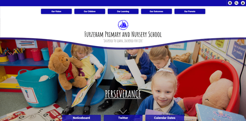
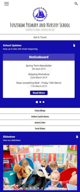
While the two versions have a similar style, the layout has automatically adjusted to suit each screen. For example, a bigger screen like a monitor or laptop suits the large, high-quality photography and still manages to provide quick access to critical information via the navigation menus. On the other hand, a smaller screen struggles to show the photography at its best, prioritising information instead.
The layout on smaller devices isn’t just a matter of what fits best in the space available; the responsive design also considers visitors’ needs at any given time.
People using mobile phones to access a site are more likely to be on the move, and looking to find specific information quickly, so it is essential to place elements like the noticeboard, lunch menu, and contact links in a prominent place.
What are the key elements of responsive design?
There are five key elements of responsive web design:
1) Compatibility
Responsive web design makes compatibility a high priority. This doesn’t just include device type, but browsers and screen size too (different mobile phone models have drastically different screen sizes). Whether building a school website from scratch or updating an old one, we highly recommend working with a developer that understands the importance of responsive design.
2) Consistency
Your site visitors should have the same experience of your website no matter what device they use. Neglect the user experience on one device, and you’ll quickly see an increase in bounce rate.
At the very least, your navigation menu, school contact information and most important information should be easily found across all devices.
3) Image optimisation
Particularly important for mobile users, images need to be available in various sizes so that the website can ‘select’ the best version of the image to load. Additionally, images need to be of high quality but small file size to accommodate website visitors that may not have the fastest internet connection.
Slow-loading web pages is a common reason people abandon websites, so this is a part of responsive design that you can’t afford to miss.
4) Intuitive navigation
The navigation bar is arguably one of the most critical elements of a website. It helps users quickly find what they are looking for and help search engines like Google better understand your website content and rank it for specific search terms.
Therefore, intuitive navigation must be implemented and accessible when creating a responsive website.
5) Whitespace
Getting the right balance of whitespace on your website across all devices, browsers and screen sizes can really amplify your content. Any padding or margin settings you implement on the desktop version of your school website mustn’t be lost when a user switches to a mobile device, for example.
It’s also vital that any padding or margin settings look good on all devices to ensure a consistent experience. Unfortunately, there isn’t a rule of thumb for the exact amount of white space or margin size; it’s very much based on a site-by-site review.

How Juniper Education can help you build a responsive website
The biggest takeaway for schools is that people access the internet in a wide variety of ways and use many device types. Therefore, modern websites cannot be designed primarily around a single viewing experience; they can’t even have just one mobile and one desktop experience. Instead, sites need to be built in a way that automatically adapts to the needs of any device type and screen size.
If your school is looking to redesign its website, we highly recommend you choose a provider who will consider the needs of responsive design and think about how your site prioritises its layout on smaller devices.
We recognise this importance for schools, so every single site we create features a fully responsive design as standard.

